transitions
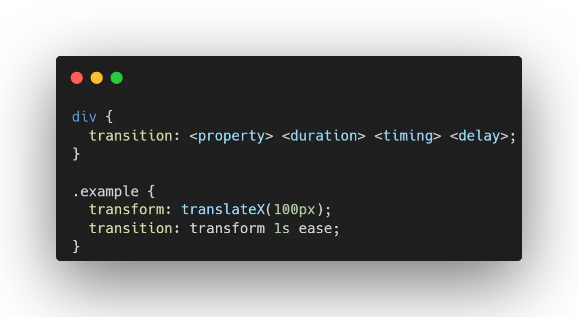
CSS transitions provide a way to control animation speed when changing CSS properties. Instead of having property changes take effect immediately, you can cause the changes in a property to take place over a period of time. For example, if you change the color of an element from white to black, usually the change is instantaneous. With CSS transitions enabled, changes occur at time intervals that follow an acceleration curve, all of which can be customized. Animations that involve transitioning between two states are often called implicit transitions as the states in between the start and final states are implicitly defined by the browser.
CSS transitions let you decide which properties to animate (by listing them explicitly), when the animation will start (by setting a delay), how long the transition will last (by setting a duration), and how the transition will run (by defining an easing function, e.g., linearly or quick at the beginning, slow at the end).
animations
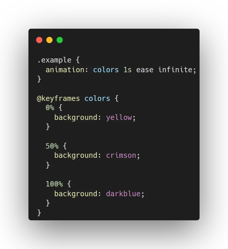
In order to create the animations we need to use the @keyframes rule. This rule specifies the animation code. The animation is created by gradually changing from one set of CSS styles to another. During the animation, you can change the set of CSS styles many times. Specify when the style change will happen in percent, or with the keywords from and to which is the same as 0% and 100%. 0% is the beginning of the animation, 100% is when the animation is complete. The following example will change the background-color of the div element from red to yellow:
interpolate-size
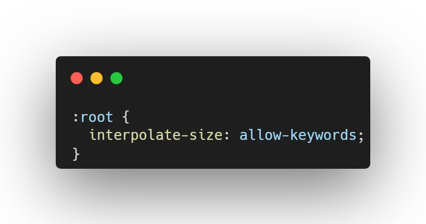
The CSS interpolate-size property allows a page to opt in to animations and transitions of CSS intrinsic sizing keywords such as auto, min-content, fit-content, etc., in the cases where we can animate those keywords. The gist is to add the following snippet to your stylesheet to opt-in to interpolating from <length-percentage>'s to any of the supported <intrinsic-size-keyword>'s or vice versa.
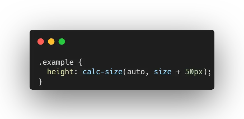
calc-size
The calc-size() function is a new addition to CSS that allows for the calculation of intrinsic sizes like auto, min-content, max-content, fit-content, stretch, and contain. This function enables web developers to animate elements with height: auto or other intrinsic sizes without needing JavaScript. calc-size() works similarly to the calc() function but can handle intrinsic sizes. It accepts two arguments: the first is the intrinsic size you want to calculate, and the second is the calculation you want to perform on that size.
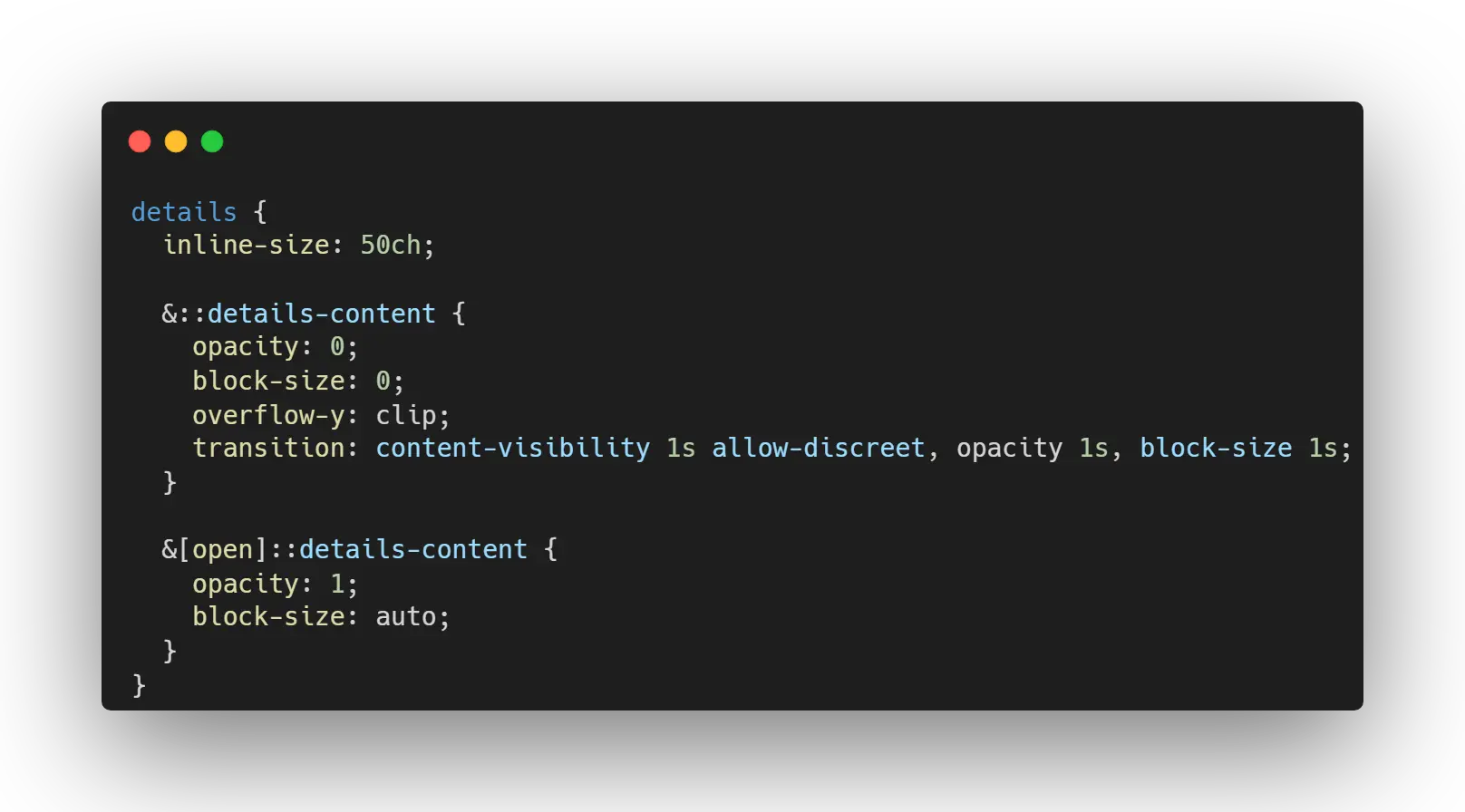
details element
The <details> element can now be animated using the interpolate-size property, allowing for smooth transitions when opening and closing. Here’s how you can implement this: Enable Interpolation - Add interpolate-size: allow-keywords; to the <details> element to enable transitions to and from intrinsic sizing keywords like auto, min-content, max-content, and fit-content.
Apply specific styles to the <details> element and its pseudo-element ::details-content to control the transition behavior.
tweens
In web animation, a tween stands for "in-betweening". Basically, it is the foundation for the whole GSAP process. There are 3 types of tweens: gsap.to("element", { variables }) animating one state TO another state, gsap.from("element", { variables }) animating one state FROM another state, gsap.fromTo("element", { variables }, { variables }) specifically choosing the STARTING and ENDING state.
staggers
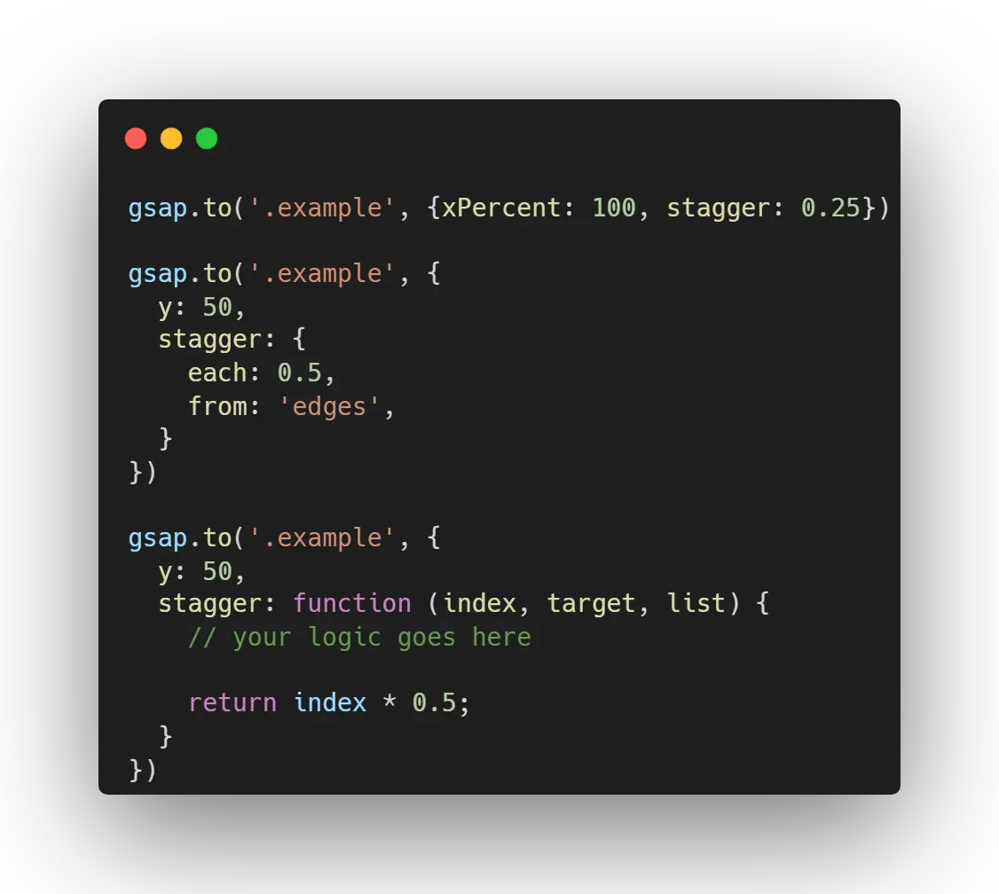
A value of stagger: 0.1 would cause there to be 0.1 seconds between the start times of each tween. You can even stagger items that are laid out in a grid just by telling GSAP how many columns and rows your grid has. A negative value would do the same but backwards so that the last element begins first. All tweens recognize a stagger property which can be a number, an object, or a function. To get more control, wrap things in a configuration object which can have any of the following properties (in addition to most of the special properties that tweens have.
functions
Only use this if you need to run custom logic for distributing the staggers. The function gets called once for each target/element in the Array and should return the total delay from the starting position (not the amount of delay from the previous tween's start time). The function receives the following parameters: index [Integer] - The index value from the list, target [Object] - The target in the list at that index value, list [Array | NodeList] - The targets array (or NodeList).
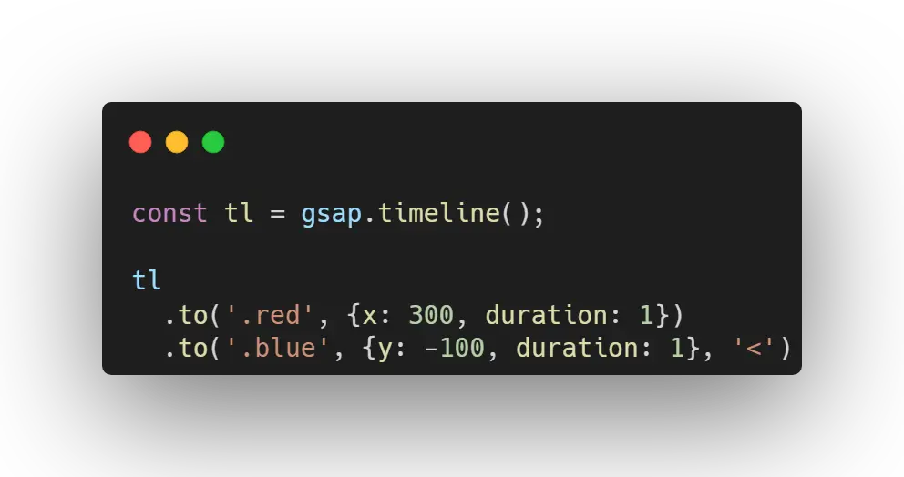
timelines
Just like we've seen with staggers, It's common to animate more than one thing. But what if we need more control over the order and timing of those animations? A lot of people reach for delays, and they're not wrong, delays do give us rudimentary control. But this method of sequencing animations is a little fragile. What happens if we lengthen the duration of the first tween? The second and third tweens have no awareness of this change, so now there's an overlap - we'd have to increase all of the delays to keep them synchronized. If you've animated with CSS you will have run into this problem before. But what if we want to add a gap or delay in between some of the tweens? One option would be to add a delay to a tween to offset it 's start time. But this isn't hugely flexible. What if we want tweens to overlap or start at the same time?
Timelines makes sequencing multiple tweens really easy and faster to code, in the long run. You can also position them with the position parameter.
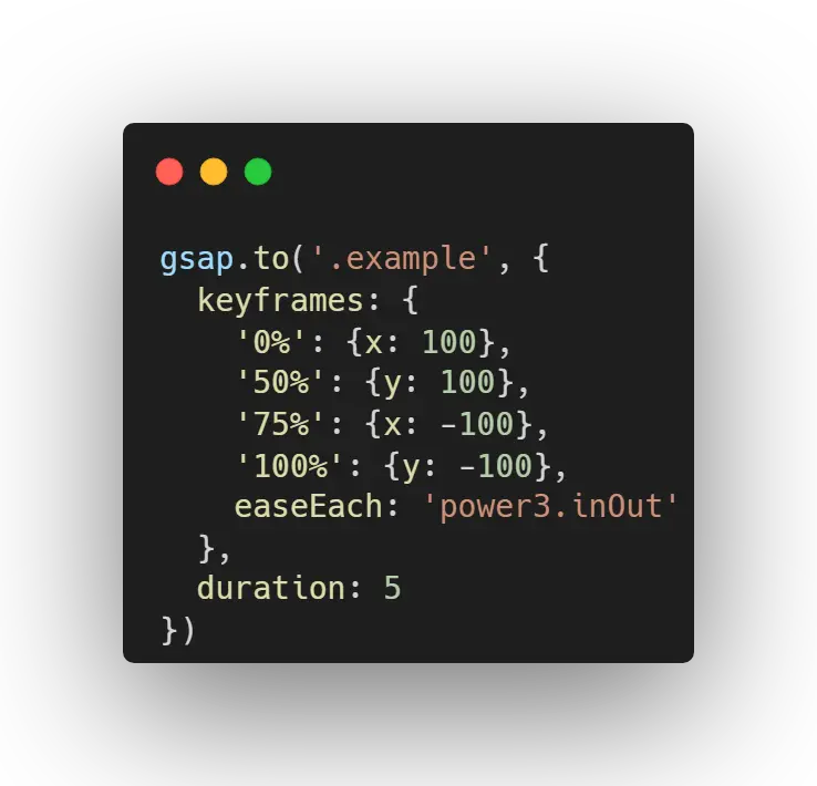
percentage keyframes
This familiar syntax makes porting animations over from CSS really easy. Instead of using delays and duration in the keyframe object, you specify an overall duration on the tween itself, then define the position of each keyframe using percentages.
position parameter
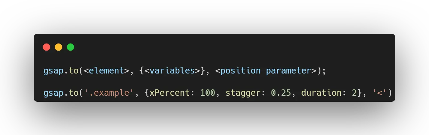
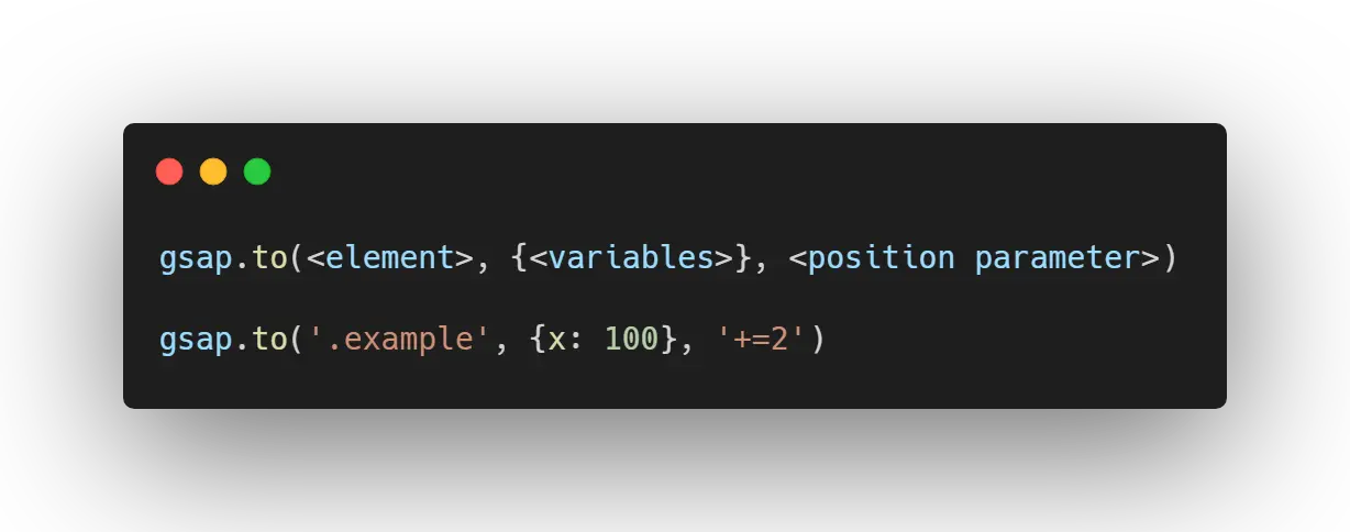
The secret to building gorgeous sequences with precise timing is understanding the position parameter which is used in many methods throughout GSAP. This one super-flexible parameter controls the placement of your tweens, labels, callbacks, pauses, and even nested timelines, so you'll be able to literally place anything anywhere in any sequence.
Notice that the position parameter comes after the vars parameter:
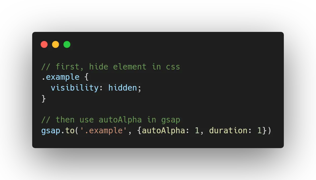
flash of unstyled content
Have you ever noticed an annoying "flash of unstyled content" (FOUC) when a web page first loads? This looks like a weird jump or lag.. That happens because browsers render things as quickly as possible, often BEFORE your JavaScript executes the first time. So what if some of your initial styles are set via JavaScript...like with GSAP?
solution
apply visibility: hidden; to your elements in CSS and then use GSAP's autoAlpha property to show it (or animate it in) when the page loads. autoAlpha affects opacity and visibility, changing it to visible when the opacity is greater than 0.
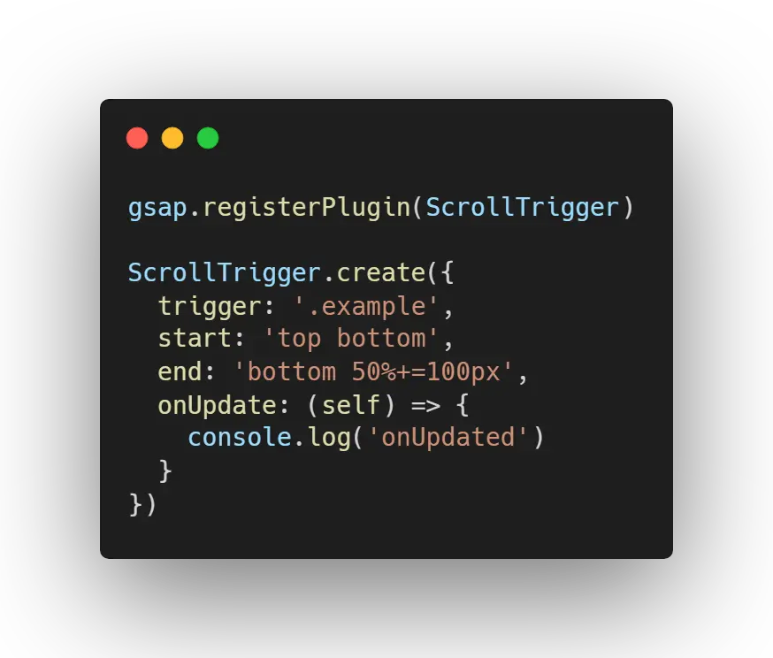
scroll trigger
ScrollTrigger is a plugin provided by GSAP. It enables anyone to create scroll-based animations with a few lines of code. Most websites that are on places like awwwards.com use scroll-based designs, and also use SVG at the same time!
You don't need to put ScrollTriggers directly into animations (though that's probably the most common use case). You can use the callbacks for anything...